Wedding beer label design
Even though I don't drink any more doesn't mean that I don't enjoy the company of those who do. Very early in our wedding planning, Jim and I decided that we would have a special beer brew in honour of the brewing he and my brother used to do regularly at Brew Brothers Microbrewery when we all lived in Brisbane. We call the boys the "Brew Brothers". Bonded by beer. Jim and Mitch agreed that the Honey Cream lager was their favourite, and since then my creative cogs have been whirring about designing a bespoke wedding label for the beer bottles.
Here's how the beer label design process played out.
Beer label design: sourcing the label
After a bit of searching the internet, we went with an American company called GrogTag.
- Their website was the easiest to navigate
- They provided downloadable templates
- The price seemed comparable, even with shipping to the UK
- The quality (vinyl stickers) looked pretty good.
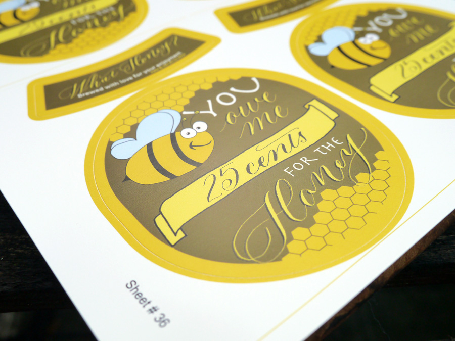
We weren't disappointed. The labels arrived in under a week, and look fantastic.
Beer label design: Concept phase
The name: "You owe me 25 cents for the honey"
Every beer has a name, and when the boys decided on a honey lager, it was a no brainer what we should call the beer. Throughout my childhood (and still now), whenever we would ask mum for the honey (or sometimes even when we didn't), the following dialogue would have to play out:
Mum: "You owe me 25 cents for the honey."
Us: "What honey?"
Mum: "Oh, I never knew you cared."
I now carry on the tradition forever more, a Pavlovian response, into our future life together; it was the perfect thing to call our wedding brew.
Jim has been a big part of all of the stationery design decisions for the wedding, and if anything, I was going to give him even more say with the beer label (with mild trepidation, given his and my eye for design slightly differ). It was, after all, his thing.
Our criteria for design:
- oval tag
- something related to honey
- my calligraphy
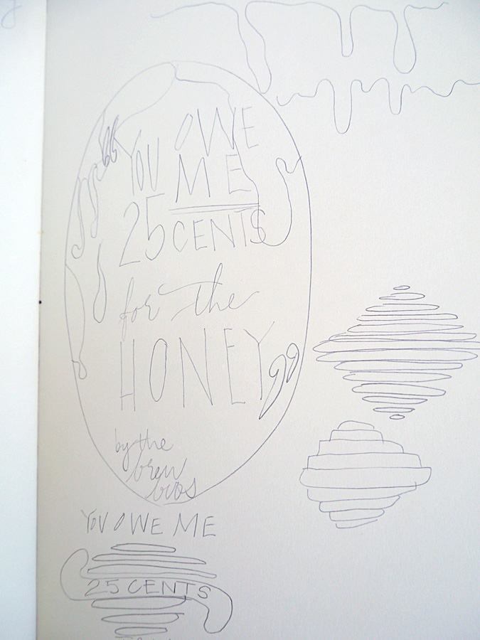
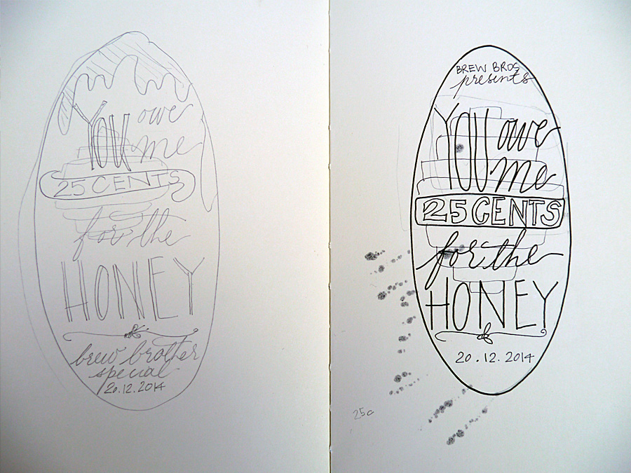
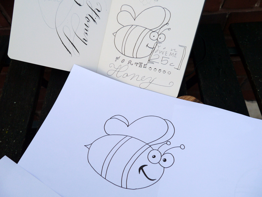
I wanted the beer label to be stylish, and I wanted to try out some typography skills I've been learning, so I started a little conceptual drawing.
At this stage, Jim interjected with some thoughts. Namely, he didn't like the beehive or the dripping honey, and that he wanted a cartoon bee. So, with a somewhat reluctant heart, I went to task to include this guy in the design. I was not convinced about including a cartoon bee on our beer label, but it was what Jim wanted.
Beer label design: Calligraphy phase
I wrote out all the words I wanted in either calligraphy or another handwriting style to scan in at high res. While I kept the calligraphy in the end, I ditched the other handwriting styles because, to be frank, I haven't done enough typographical study to be confident with my work. We instead found a great complimentary font and rolled with that.

Beer label design: Layout
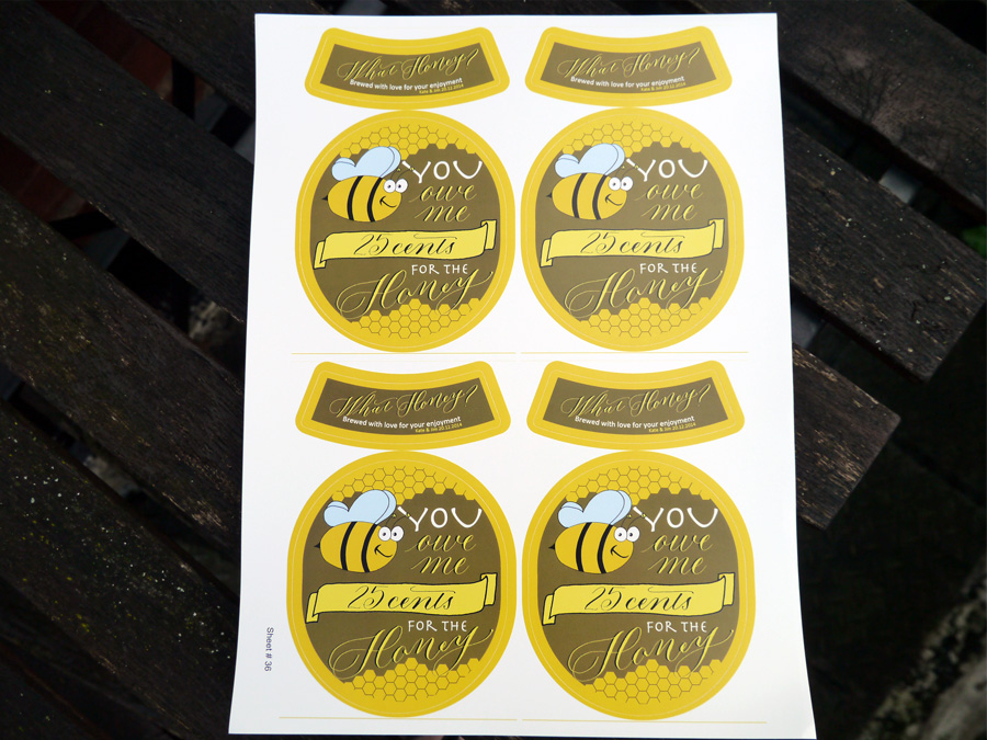
The final step was for us to put it all together in Photoshop. We had the GrogTag template to guide us on sizes, so all that was left was to import the scanned images and writing, style and adjust to fit, and choose our colours.
In addition to the calligraphy and the bee, we both wanted to add some honeycomb. Jim smartly suggested using the hexagonal tool (I was trying to draw them very shoddily), and after a general colour agreement of green and gold, a nod to our Aussie heritage, we shifted from pastels to the deep hues we settled on in the end.
I think we've all earned a brew, don't you!
Designed by: Olive & Reid Studio Printed by: GrogTag
